The 15-Employee Turning Point: What Growing Teams Don’t Expect
April 7, 2026
Blog Posts

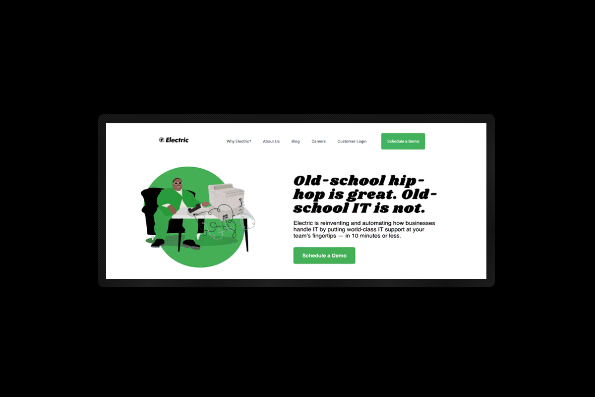
Electric launched a completely new look and feel to our brand and website on July 28th, 2022. The update marks an inflection point in the evolution of our product and company as a whole, and provides visitors with a completely new experience when coming to our website. Check out our newest video about the refreshed brand here:
Below, we’ll be talking about the decision to update the Electric brand, the work that went into this overhaul, and some of the things visitors can expect to find on the site.
Electric fundamentally represents a different way for small and medium sized businesses to solve for IT. We strive to help companies of all types with things like:
However, differentiation isn’t just for product, we believe that our differentiation should seep into every outlet of our brand, down to the visual makeup and the tone.
Typically, a rebrand is a complete overhaul. From the brand tone, messaging, colors, logo, fonts and general creative direction to either fit into a new market, scale into a more mature brand, or to fill a gap or need presented by a competitive source.
Electric already had an excellent foundation that we wanted to update and upgrade, so rather than a complete rebrand, we view this a more of a brand refresh, including:

From Andrea Kayal, CMO
Join us at Elevate 2022, our annual conference!At its core, a brand represents the ethos of a company– the beauty of the design and the simplicity of the message creates powerful emotions that either move people to act or not. I believe this refresh has been a defining example of how to use a brand to inspire action and this project has been the highlight of my career. I hope you enjoy reading about the defining moments that got us there.
While our business strategy is business to business (B2B), we approach our creative marketing brand with a business to consumer (B2C) style. Our philosophy is that the same customer, purchaser, executive, and decision maker, is also a consumer that deserves a more engaging experience, with colorful ads, content, music, and messaging that is full-of-life.
When approaching this project we asked ourselves: Why settle for standard business to business color palette theory, conceptual formatting, and formal tones? We are full of energy, life, vibrancy, and speed. We are caring people who let our personalities shine, so we created the same for our creative brand and our marketing values.

From Joann Martin, VP of Brand:
We were really inspired by brands in fashion and fintech. Especially as fashion brands are melding into tech in a lot of ways, you see them truly push for emotionally compelling experiences across digital. Outside of the visual brand, I also took a lot of inspiration from companies who have really grown up serving the SMB. So I’m always reading through sites from Shopify, Mailchimp, Quickbooks, for example. Because they really grasp how to speak to that audience.
Our new refreshed brand stands for success in regards to how far we have come, and where we are going. It represents the caliber of excellence we represent, and our high-standards we hold ourselves to, which is represented in the service, product, and entire Electric experience we offer, for customers.
Electric isn’t your standard IT service provider. We are approachable, we are non-judgmental, we are vibrant, and we will express that in every interaction with our customers. The key changes that were made visually within this update represent that logic:
Our previous site was like a lego building that earned new layers every time we advanced as a company. While it was a great site, we created a new version that makes it easier to understand everything that makes up the Electric experience for our customers.
The new Electric website now has a dedicated section that makes it easier to access resources in our Help Center, or learn about customer programs like the Electric Insider Council. For future customers, the new site is easier to navigate. We’ve added paths for company teams like Human Resources or Operations, IT situations based on your role, and “jobs to be done” or use cases for our customers.

From Danielle Cohen, Creative Director:
I like to think of our brand as our “house.” Our house, aka our brand, represents all of the people who live inside of it. It represents all of the personalities, the values, and the impact of each employee who is contributing to our future. It holds all of our valuable resources that make us who we are, all of the rooms and items that makeup the content, technology, and support we are building, and much more.
Our home is full of life, of new items, new personalities, and we were outgrowing our old home! We needed a home full of color and vibrancy, to represent our people, and our success, with big welcoming doors. We’re excited to build a new home that allows us to continue to grow and scale… to create the ideal home for all of the places we plan on going.
Electric’s brand refresh was initiated in December of 2021, with an initial pitch from our creative team to leadership and related teams. This pitch contained the value of a refresh, including the impact and importance of taking these next steps. This included collaboration across creative, brand, research and user-testing, demand, security, legal, executive, and product teams.
The first step to a rebrand is understanding who we are as a brand currently, and our aspirations of who/where we would like to go. This is done by interviewing key stakeholders across the business, assessing market trends, and defining our brand value. From here, we took the following steps:
Electric has always had a focus on developing an engaging, interesting brand. Thanks to our marketing team, we now have a phenomenal new website that helps Electric stand out.
This is also just the beginning of everything Electric has coming in 2022! To learn more about everything that Electric has to offer, join one of our upcoming events, like our Innovation or Leadership webinars, and don’t forget to join us in October for Elevate 2022! If you’d like to follow along and stay up to date on everything that we’re doing, follow us on Twitter, Instagram, LinkedIn, and Facebook!

Warren Duff
Warren Duff is Electric's Director of Content Marketing, he's been writing and managing content for the internet and SAAS companies for more than a decade.